Finalizing your wedding seat chart can be enough to make you pull out your hair: trying to figure out which guests to put in a table together and who to avoid seating together (you don’t want to seat your uptight uncle next to your very liberal work colleague after all!) requires a lot of logistical planning. It’s also something that you can’t pass on to your wedding planner; you have to do yourself because ultimately, these are your guests and you want everyone to be happy and have fun during the reception!
Once you’ve figured out your seating chart comes another challenge: how do you tell people where they’re seated? Usually, there’s a table filled with people’s names and their table/seat numbers, but we all know how messy and time consuming that can get, especially when the names aren’t in alphabetical order! Luckily, there are lots of great ideas out there and so many creative ways to make your seating chart fun and interactive for your guests. It’s also easy to customize your seating charts to adapt to your wedding theme, wedding colors and budget. Here are some of our favorite ideas for wedding place cards:
Image by Style Me Pretty via Pinterest
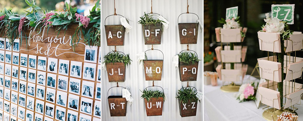
This adorable and unique seating chart utilizes Polaroids of guests in lieu of names, making it much easier for the guests to locate their seats. All they have to do is find their Polaroids, flip it around, and their table numbers are written at the back! This also shows a lot of effort taken on the host’s part, making it all the more memorable and intimate.
Image by A Typical Pea via Pinterest
This is a great example of adapting your seating chart to your theme and reception setting. Whether the photo above was taken in a wedding reception held in an old library, or the bride and groom simply love Scrabble and literature, it’s easy to incorporate your personality and wedding theme!
Image by The Bridal Detective via Pinterest
Perfect for outdoor receptions, this seating chart display is not only organized well and allows multiple guests to access their seats at the same time, but it also adds a touch of beautiful rusticness to the setting.
Image by HappyBlueCat via Etsy
This is a wonderful example that sometimes simplicity really is the way to go. By putting the guests’ last names in alphabetical order and incorporating a gorgeous color palette, this seating chart is a no-fuss approach to modern seating charts.
Image by Mark Tioxon
This is such an entertaining way to introduce your guests to their seats. While this may not be the most organized way to do that, your guests will definitely have fun!
Image by Sweet Zion Paperie
This organized way of displaying your guests’ names not only looks cool and modern, it’s also ideal for smaller tables since it takes up so little space. It’s also so easy to use your wedding colors for this type of seating chart display.
Image by The Full Bouquet via Pinterest
Food is always a good idea, especially chocolates! Not only does this tray of place cards look beautifully presented and adds a touch of gold to the room, it also lets guests enjoy chocolate treats en route to their tables.
Image by Zelo Photography via Wedding Chicks
Witty and whimsical, this will definitely guarantee some Instagram-worthy shots! Just make sure to put the names of your taller guests at the top of the door and you’re all set!
